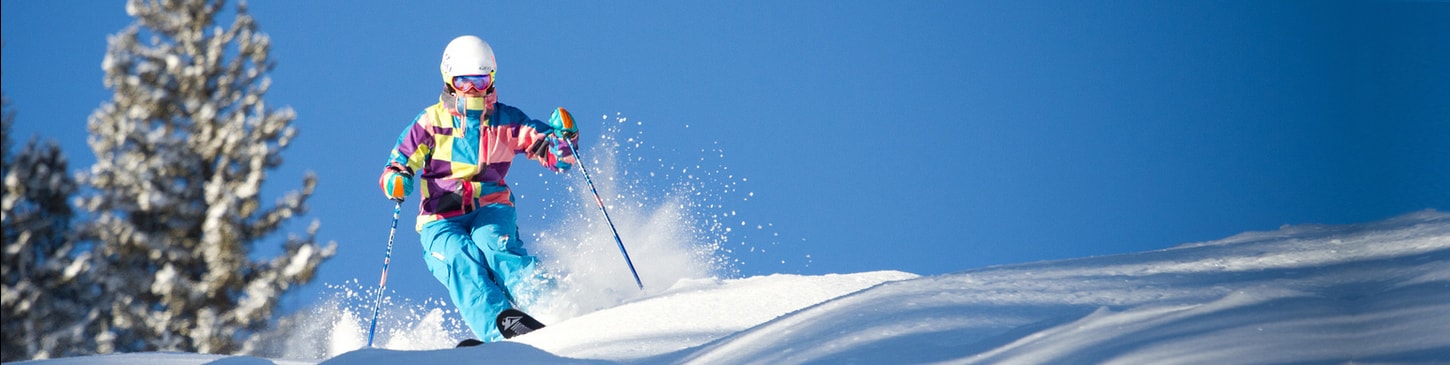
Buy Lift Tickets in Advance and Save! Liftopia Liftopia Logo Search Thousands of Lift Tickets & Passes
Search Lift Tickets

Style Guide

Elements / Colors
$white
#FFFFFF
$snow
#F5F5F5
$glacier
#EFF2F4
$cloud
#D0D6D9
$storm
#A4AAAD
$gravel
#7B878E
$river
#608090
$gunmetal
#34454E
$slate
#1B2731
$bluesky
#77A2D6
$lagoon
#36AEEB
$liftopiablue
#0085CA
$royalblue
#1976D2
$evergreen
#03514A
$meadow
#22AF60
$hazard
#DFDA22
$liftopiaorange
#EE7E43
$tangerine
#ED6033
$brickred
#8E1E21
.blue-gradient
#1976D2 (left), #36AEEB (right)
.orange-gradient
#EE7E43 (top), #ED6033 (bottom)
Elements / Typography

HEADER FONT

Raleway

Used for nearly all headers and large display text.

Download

BODY FONT

Roboto

Used for all body text and numerals.

Download

NUMBERS

1234567890

As you can see above, Raleway's numbers look drunk. Wherever needed, use this helper class to transform the font to sober Roboto.

.numbers | font-family: 'Roboto'

Header 1

h1 | .header--1 | Raleway 32 semibold 600

Header 2

h2 | .header--2 | Raleway 24 semibold 600

Header 3

h3 | .header--3 | Raleway 20 semibold 600

Header 4

h4 | .header--4 | Raleway 18 bold 700
Header 5
h5 | .header--5 | Raleway 16 semibold 600
Header 6
h6 | .header--6 | Roboto 16 bold 700

Paragraph text

p | Roboto 16 regular 400

Label

.label | Raleway 16 semibold 600, letter-spacing: 1px

Small Grey

.small-grey | Roboto 14 regular 400 $gravel

Small Bold

.small-bold | Roboto 14 bold 700

Tiny

.tiny | Roboto 12 $gravel uppercase, letter-spacing: 1px
Elements / Buttons

Highlight Button

Should be used as the primary call-to-action on the screem. Use sparingly.

.button--primary

Primary Inverse Button

Should be used when there is already a more important primary button on the screen. Use for actions that you want to emphasize.

.button--primary-inverse

Secondary Button

Should be used sparingly and only when other button options look off in the layout.

.button--secondary

Secondary Inverse Button

Should be used for layouts in which an orange button is too loud. Great for sub-actions such as the date-picker or filter dialogs.

.button--secondary-inverse

Secondary Transparent Button

Should be used for tertiary or less-important actions in a layout. Great style for links that need a bit of oomph.

.button--secondary-transparent

Plain Link

Default link style. Use for less-important links.

a

Bold Link

Bolded link style. Use for added emphasis.

a .typography--bold

Danger Button

Should be used as a visual warning for destructive actions.

.button--danger

Danger Inverse Button

Should be used to de-emphasize a destructive action.

.button--danger-inverse

Grayscale Button

Should be used only for de-emphasized subactions.

.button--grayscale

Grayscale Inverse Button

Should be used only for super de-emphasized subactions that you don't really want anyone to click.

.button--grayscale-inverse

Disabled Button

.button disabled="disabled"

Facebook Button

.button--facebook

Google Button

.button--google

Button Icons

.button options: { :icon_type => 'chevron-right' }

.button options: { :icon_type => 'chevron-right', :icon_position => 'left' }
Elements / Forms

Input Field

Should be used to collect short bits of text.

Validated Text Field

Should be used to collect text with specific requirements.

    Text Field w/ Check

    Should be used to collect text with specific requirements.

      Disabled Text Field

      This is what the text field looks like when its disabled.

      Select Dropdown

      Should be used to collect a selection.

      Checkbox

      Default checkbox style.

      Radio Button

      Default radio button style.

      Elements / Icons

      ICON FONT

      FontAwesome

      Free to download and use for web and print projects.

      Download
      Elements /Shadows

      Global Shadow

      Add a box-shadow to containers to create a sense of depth in a layout. Wherever possible, use the global shadow variable for consistency.

      $global-shadow box-shadow: 0px 2px 4px rgba(27, 39, 49 ,0.25)
      Utilities / Rollover
      Utilities / Spacing

      Global Spacing Variables

      $global-margin = 1rem (16px)
      $global-padding = 1rem (16px)

      Standardized Spacing

      $spacing-xs = 4px
      $spacing-s = 8px
      $spacing-m = 16px
      $spacing-l = 24px
      $spacing-xl = 48px
      $spacing-xxl = 96px

      Spacing Helper Class Recipe

      Can be applied as a class directly on element that needs the spacing tweak

      [property][direction][delimiter][size]

      For example

      m-xl = margin: 32px;
      py-m = padding-top: 16px; padding-bottom: 16px;
      mt--xs = margin-top: -4px

      If class does not work, you will need to create it in framework.scss

      Property

      m = margin, p = padding

      Direction

      t = top, b = bottom, r = right, l = left, v = vertical, h = horizontal, none = all directions

      Delimiter

      - = positive value, -- = negative value

      Size

      a = auto, 0 = 0, xs = 4px, s = 8px, m = 16px, l = 24px, xl = 32px, xxl = 64px
      Components / Alerts
      I'm a success Alert!
      I'm an info Alert!
      I'm a warning Alert!
      I'm a danger Alert!
      Components / Cards
      Components / Date Picker
      Components / Loading Spinner

      Loading...

      Components / Stateful Row
      An active row.
      An neutral row.
      An inactive row.
      Templates / About

      About California: Lake Tahoe & Northern Skiing and Snowboarding

      10,780 ft base elevation
      13,050 ft peak elevation
      2,270 ft vertical drop

      Lorem ipsum dolor sit amet, consectetur adipisicing elit, sed do eiusmod tempor incididunt ut labore et dolore magna aliqua. Ut enim ad minim veniam, quis nostrud exercitation ullamco laboris nisi ut aliquip ex ea commodo consequat. Duis aute irure dolor in reprehenderit in voluptate velit esse cillum dolore eu fugiat nulla pariatur. Excepteur sint occaecat cupidatat non proident, sunt in culpa qui officia deserunt mollit anim id est laborum.

      Templates / Amenities

      Active Amenity

      Inactive Amenity

      Templates / Layout
      Hero
      Main Content
      • Resort 1
      • Resort 2
      • Resort 3
      • Resort 4
      • Resort 5
      • Resort 6
      • Resort 7
      • Resort 8
      • Resort 9
      • Resort 10
      • Resort 11
      • Resort 12
      • Resort 13
      • Resort 14
      • Resort 15
      • Resort 16
      • Resort 17
      • Resort 18
      • Resort 19
      • Resort 20
      • Resort 21
      • Resort 22
      • Resort 23
      • Resort 24
      • Resort 25
      • Resort 26
      • Resort 27
      • Resort 28
      • Resort 29
      • Resort 30
      Templates / Search Input
      Templates / Trail Counts

      Beginner

      Beg.

      11

      Intermediate

      Int.

      33

      Advanced

      Adv.

      65

      Expert

      Exp.

      25